

Case Review
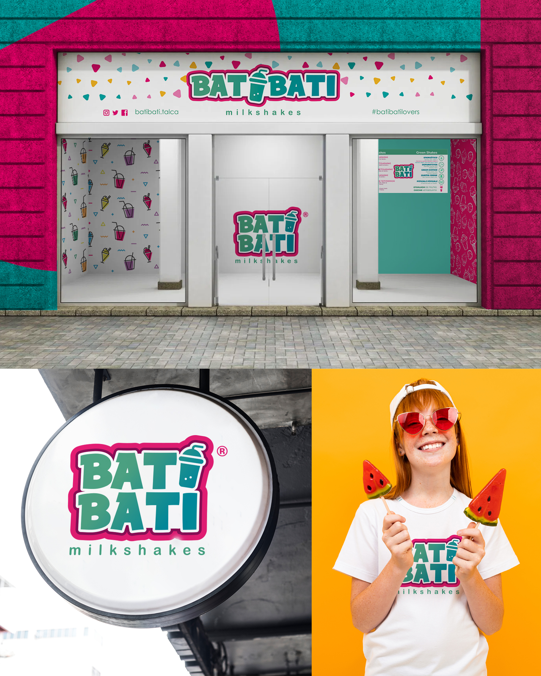
We take care of branding, stationery, uniforms, and visual merchandising, supported by a festive aesthetic, where color invites to play with flavors. In each designed piece, you can smell the milkshake, and you can even deduce from what flavors the brand’s products are made, due to fair use of the shapes and color that goes with it. This company, located in Chile, now enjoys an identity based solely on the essence of milkshake and everything it represents.
Project time
2017 September – 2018 March
Origin of the logo
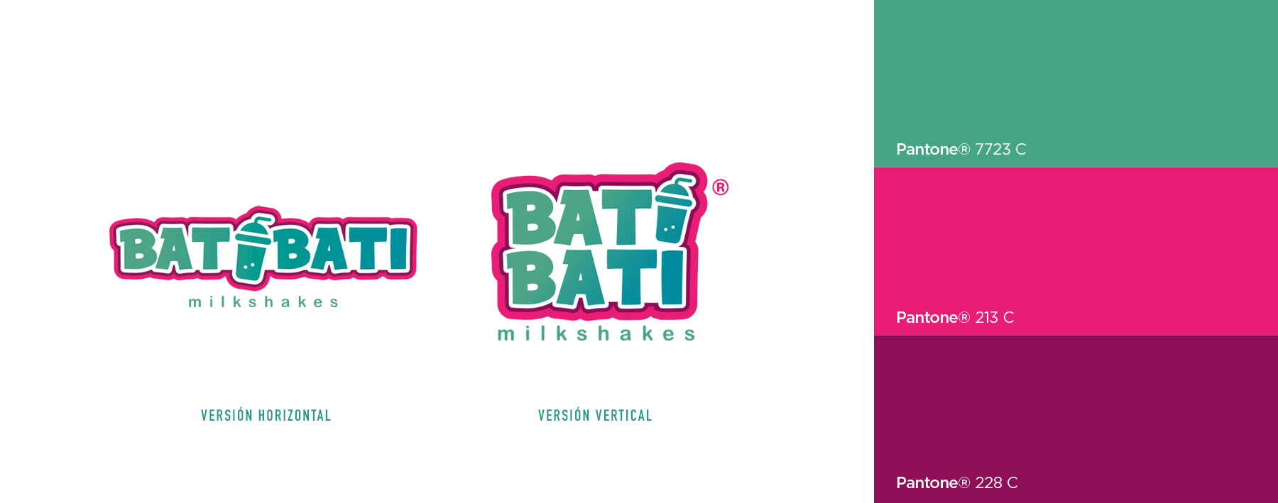
We are rooted in the freshness and sweetness of the drink, to generate a unique synergy between typography, shape, and color, highlighting the iconic shake glass as a focal point. Taking into account the young, millennial population that enjoys this product, we aim for fun, inviting you to try a feast of delicious flavors.
Colors
Turquoise | Purple | Fuchsia
Isotype
Smoothie
